The USFL is back as another attempt for an alternative league to the NFL, after the failures of the AAF and the XFL, although the latter was due to COVID-19.
After running from 1983 to 1986 and dissolving in 1990, the United States Football League (USFL) announced its return in June 2021 with the season kicking off this April.
There are 8 teams, 4 in each division. Here are the teams with their newly announced uniforms.
SOUTH DIVISION
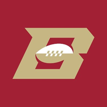
Birmingham Stallions

Gotta have a horse in a football league, its a requirement, but its a solid name and a decent logo. Really following the 49ers color scheme almost exactly, nothing special, but solid either way. Stallions works for Alabama too, no clashing of names and cities.

Houston Gamblers
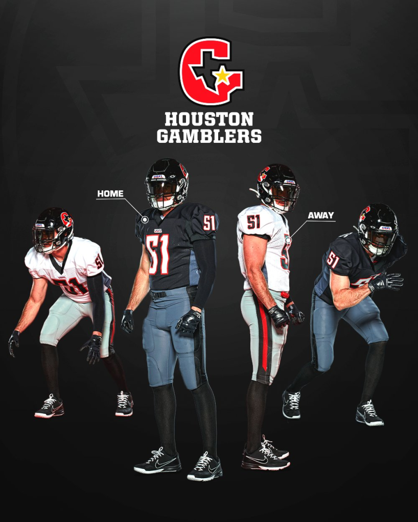
Love the incorporation of the Texas outline in the logo. Kinda gets wonky at the tail of the G, but it works. There always seems to be a black white and red team in the alternate football leagues, and these are solid. Is Houston known for gambling?

New Orleans Breakers

Now this, this is BEAUTIFUL. This is a sharp blue on blue combo that I love. Blue is my favorite color so I am biased. I love the Breakers theme with the waves, something you really don’t see in sports, especially football, we need more nature in team names. I don’t quite agree with this team in New Orleans, I don’t think of waves and surfing and beaches when I think of New Orleans. Great team, wrong city.
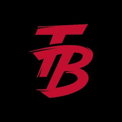
Tampa Bay Bandits

I like the Bandits name, solid logo, but it doesn’t fit with Tampa. No one thinks wild west and thieves when it comes to Tampa, feels more like an Arizona team. I like the color scheme with the red silver and white, its a red not seen in the NFL.
NORTH DIVISION
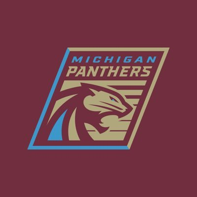
Michigan Panthers

The maroon, gold, and blue combo is a unique one for sure. The logo looks like someone used the paint can tool in MS Paint and accidentally used it in places they shouldn’t. A little too much color that otherwise go pretty well together. Not sure how I feel about another Panthers football team, but Michigan Panthers kinda flows.

New Jersey Generals

Classic red and white, one of the most common color combos in all of sports. Really nothing special. The logo is meh, just a basic coat of arms, nothing special about New Jersey in it, just a very generic team. The name flows nicely though, for what it’s worth.

Philadelphia Stars

Another red team, but with a nice golden piss yellow secondary color, which is nice. I like the 3D aspect of the star logo, showcases the different colors. I like the stripes on the pants, very unique. The name flows nicely too. Stars feels like a name that should be in every sport, but it’s only in hockey. Shame.
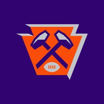
Pittsburgh Maulers

A very Clemson Tigers meets Phoenix Suns color combo. Two colors not paired together look pretty decent here. No unique feature on the uniforms, just a classic style. Pittsburgh football loves showcasing their workers, with the Steelers and now the Maulers, and I just learned that a maul is a type of axe or hammer. The colors don’t scream Pittsburgh, but I’ll let it play out.
